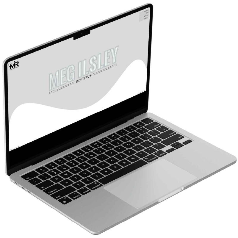
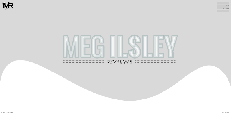
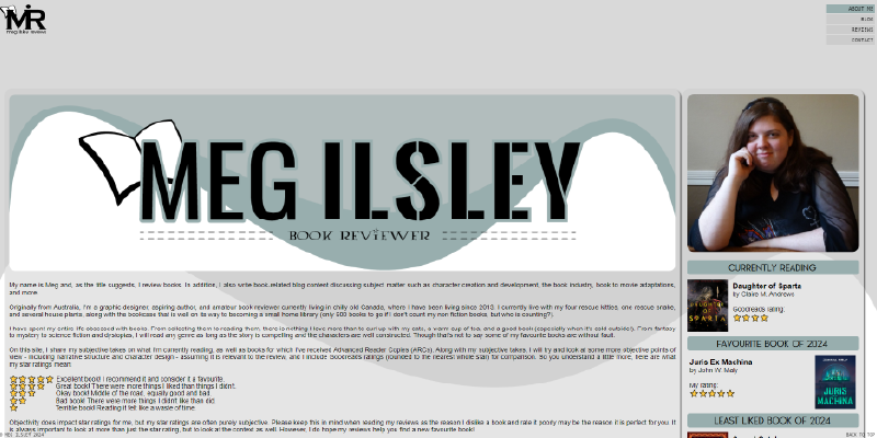
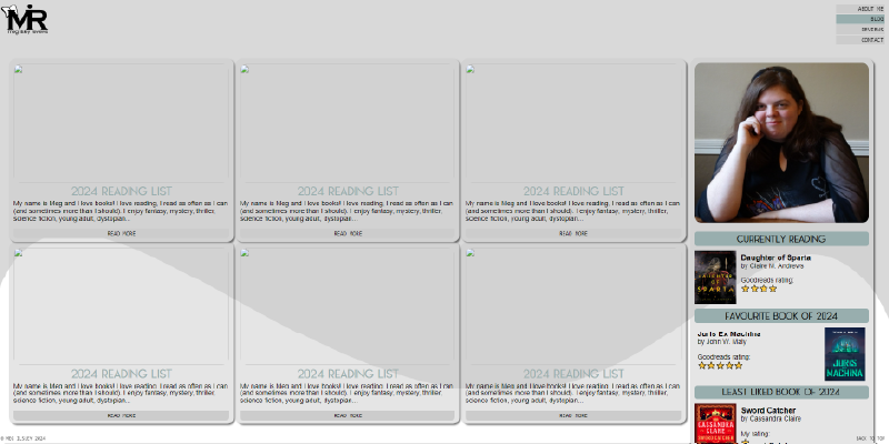

Meg Ilsley Reviews
Designed to pair with (but not match exactly) the "Meg Ilsley Designs" brand and create personal brand continuity, this project was developed with the goal of designing a book review blog website and logo. Like with the Designs branding, simplicity and accessibility were key and incorporated as part of the font choices and colour contrast.
The decision to use black font on a white background was made to evoke the feeling of reading a book, whilst the grey highlights were added to break up the brightness of the vibrant white colour. The addition of the blue highlights ties the design back in to the Meg Ilsley Designs brand.
The decision to use black font on a white background was made to evoke the feeling of reading a book, whilst the grey highlights were added to break up the brightness of the vibrant white colour. The addition of the blue highlights ties the design back in to the Meg Ilsley Designs brand.
Project Components
- Logo
- Mini Brand Style Guide
- Website
Featured Skills
- Logo design
- Style guide design
- HTML, CSS, JavaScript
Programs Used
- Adobe Illustrator
- Adobe InDesign
- Visual Studio
Collaborators
- None / Solo Project